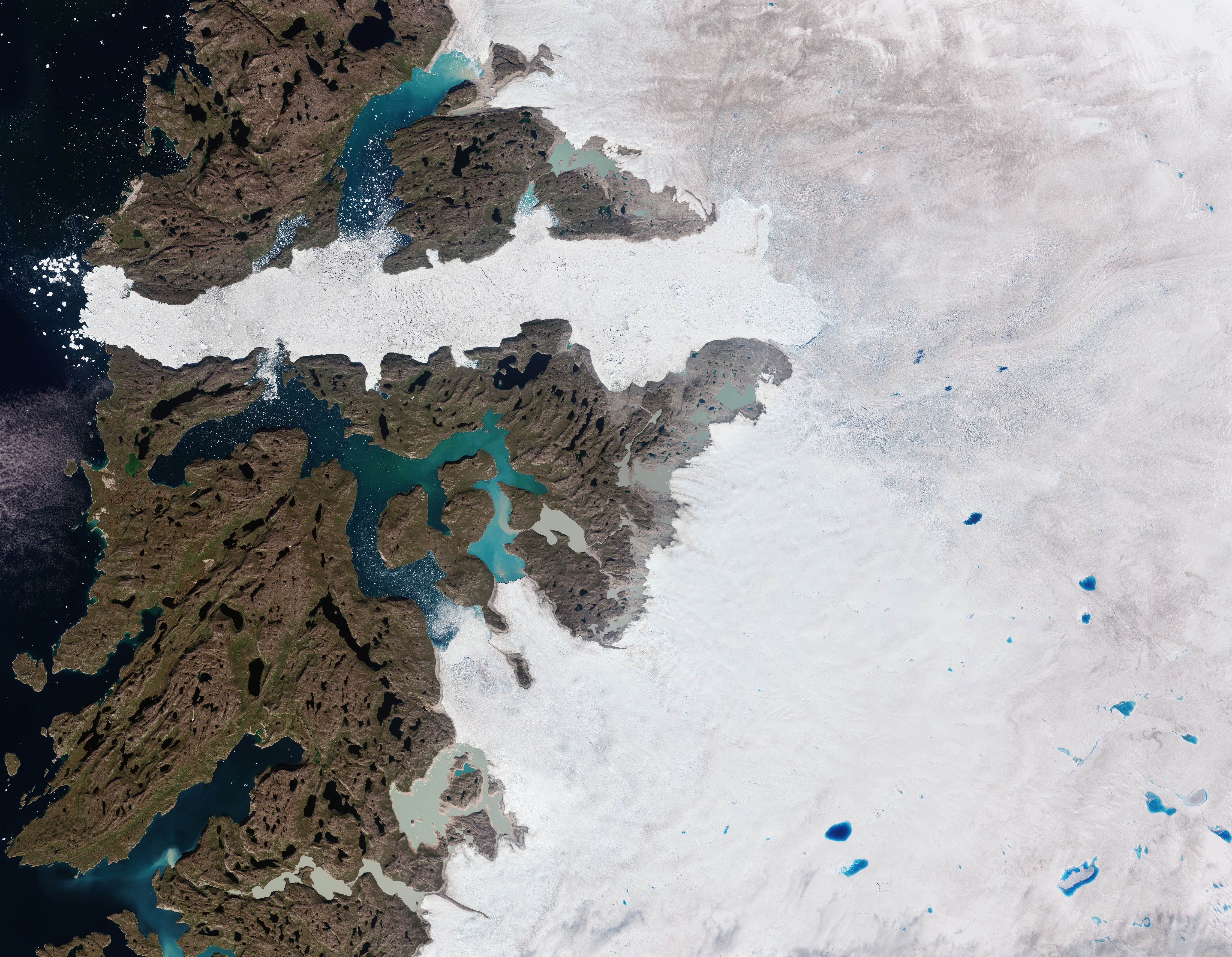
A map showing how small some countries really are has left people shocked. Reddit users have been surprised by a map showing the real size of countries was posted on the site, in the week after Donald Trump showed he quite fancied a slice of Greenland - an autonomous Danish territory that looks far bigger on typical maps than it actually is.
The Mercator Map Projection was developed by a Flemish cartographer named Gerardus Mercator in 1569 and it is one of the most well-known map projections. It was originally designed for navigation purposes, despite this meaning that many countries featured on the map are distorted in shape and size. A map posted on Reddit, however, shows countries true to their shape and size.
One user commented: "So Brazil is actually enormous.". Another user added: "It’s always mind-blowing to see how distorted the Mercator projection really is. For example, Greenland looks almost the same size as Africa on that map, but in reality, Africa is about 14 times bigger! Australia and South America also look way larger than they actually are compared to other continents.
"The Mercator projection was useful for navigation back in the day, but it really warped how we view the world. It’s crazy to think that so many of us grew up with such a skewed sense of geography!". The reason the Mercator projection is distorted is because it maps the globe onto a cylinder. Areas near the poles are greatly exaggerated in size compared to areas near the equator. Mercator projection stretches the map vertically to maintain straight longitude and latitude lines, and this alters the size and shape of countries.